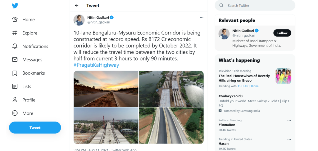
Twitter new fonts have been introduced to make it look more attractive to its users. The design has been revamped and the announcement was made from the official Twitter handle.
Twitter was planning this update from January and revealed that they are planning to roll out new fonts.
They wrote about the Twitter new fonts
Notice anything different?
Today, we released a few changes to the way Twitter looks on the web and on your phone. While it might feel weird at first, these updates make us more accessible, unique, and focused on you and what you’re talking about.
Let’s take a deeper look. Thread
In January, we revealed our new font, Chirp — and it’s ready for you to use today.
— Twitter Design (@TwitterDesign) August 11, 2021
All Western-language text now aligns left, making it easier to read as you scroll. Non-Western languages remain unchanged.https://t.co/nlgxXJs5F6
In series of tweets, they also informed about changes in button style.
Finally, we cleaned up a lot of visual clutter.
— Twitter Design (@TwitterDesign) August 11, 2021
There are fewer gray backgrounds and unnecessary divider lines. We also increased space to make text easier to read.
This is only the start of more visual updates as Twitter becomes more centered on you and what you have to say!
Also read- Find Deleted Tweets From Twitter [3 Easy Ways]
Twitter New Fonts In Details
Twitter is making changes to its Web and mobile apps to make them less cluttered and easier to use. The design changes are intended to make Twitter “more accessible, unique, and focused” on users and what they are saying. The addition of a new font called Chirp is one of the changes.

This font family, which was released in January, is a mash-up of American Gothic and European Grotesque styles. It incorporates handcrafted quirks of early woodcut specimens.
The social media platform announced the design changes on its Web, Android, and iOS platforms via its official Twitter Design account. The interface colors have been updated to provide more contrast and less blue.
This change is intended to increase the visibility of photos and videos shared on the platform. Twitter says it is also looking to provide users with new palette options, including new color options, in the near future.
Twitter is also introducing new high-contrast buttons to make the “most important actions” stand out. Changes have also been made to the ‘Follow’ button. It is now black in color, which makes it easier to see what actions you’ve taken at a glance.
Though some users did not like the new color of the follow button which is now black.
Don’t like the appearance of the new Twitter. I keep thinking I am not following people when I am! Why have you done this @TwitterUK @TwitterSupport? It’s horrible!
— Anne Greensmith 💙 (@snowleopardess) August 12, 2021
The visual clutter has been reduced to make the text easier to read and the media more visible. Twitter has reduced the number of grey background areas and eliminated unnecessary divider lines. It also increased the space between texts to make reading easier.
The Chirp font is now available to all Web, Android, and iOS app users. Previously, Twitter’s platforms used fonts such as SF Pro, Roboto, and Helvetica Neue.
Chirp is Twitter’s first proprietary typeface, and it aims to be sharp and legible (with good density) while also retaining personality and distinctiveness. The font was created in collaboration with the Swiss-type foundry Grilli Type Foundry.
Some users also compared the font change and icon redecoration.
before and after on Twitter#TwitterFont #Twitter pic.twitter.com/rzlKGj2wWp
— d (@fjj9j876) August 12, 2021
Wrapping Up Twitter New fonts
Twitter believes that the changes will attract users and also it will help them in reading tweets with more ease.
